Friday, December 10, 2010

POINT: EXPLORATIONS

The explorations unit was an introduction to all the mid  century modern architecture from the 1950s and the architects that made a difference during this period of time. Frank Lloyd Wright's principles of organic architecture combined with many elements reflected in the International movements including the work of Le Corbusier, and Mies Van Der Rohe. Like many of Wright's designs, mid century architecture was frequently employed in residential structures with the goal of bringing modernism into America's post war suburbs. This style emphasized creating structures with ample windows and open floor plans with the intention of opening up interior spaces and bringing the outdoors in. Many mid century houses utilized then groundbreaking post and beam architectural design that eliminated bulky support walls in favor of walls seemingly made of glass. Function was as important as form in mid century designs, with an emphasis placed specifically on targeting the needs of the average American family.


Later, some of the important architects that were revolutionizing the European architecture, brought some of that modern style to the great North American country. It was just the beginning of how European architects would influence a lot of the architecture in the United States that we see today. We talked about how Eero Saarinen contributed to the design of modern structures here in the United States, bringing some of that modern European style to North America. 
One of the examples we talked in class was the Dulles Airport in Northern Virginia, this particular structure included a landscaped man made lake to collect rainwater, a low rise hotel, and a row of office buildings along the north side of the main parking lot. The design also included a two level road in front of the terminal to separate arrival and departure traffic and a federally owned limited access highway connecting the terminal to the Capital Beltway I-495 located approximately 17 miles  to the east.


The European architects kept migrating to United States, and a lot of these european architects influenced a lot of the modern architecture from the 1950s. Ludwig Mies Van Der Rohe (German architect) was another remarkable architect that influenced a lot of the modern architecture in North America. After 1933, Nazi political pressure soon forced Mies to close the government financed school. He built very little in these years one built commission was Philip Johnson's New York apartment; his style was rejected by the Nazis as not "German" in character. Frustrated and unhappy, he left his homeland reluctantly in 1937 as he saw his opportunity for any future building commissions vanish, accepting a residential commission in Wyoming and then an offer to head the department of architecture of the newly established Illinois Institute of Technology in Chicago. Here he introduced a new kind of education and attitude later known as Second School of Chicago, which became very influential in the following decades in North America and Europe.


We learned in class that Chicago was one the cities where modern architecture was reflected the most and New York the second city with population growing, the need for high rises were necessary to accommodate people. 
The IBM Plaza building in chicago is one the examples of numerous projects that
Mies built in the United States


As we approached the end of the class, we studied the "hi tech" movement in the 1980s. A style of architecture and design that emerged in the 1980s, inspired by and embracing modern technology. It is characterized by visual simplicity, elegance and the use of industrial to refer to the development in the Modern Movement when designers began using new materials, such as glass, bricks, metals and plastics in favour of traditional materials; this is sometimes called the "industrial" style. This period of time is when the interiors of buildings were starting to be revolutionized by using a wide range of new materials from that era as illustrated below with the image of Interior of a mausoleum with decorative railing at Pinelawn Memorial Park in Farmingdale, Long Island, New York.

Thursday, December 9, 2010

COUNTERPOINT: MACHINE

For this assignment I did paragraph and artifact, basically the idea here was to link how the "hi tech" movement allowed the interiors to change and incorporate different materials. I focused on how galvanized steel cables were incorporated on this Joe's cafe restaurant to provide a sort of tension force applied to the wall. Bridge engineers often look for tension, and the best material for this is steel cables.

Wednesday, December 8, 2010

END OF SEMESTER FINAL PROJECT [IARC 211]

The main purpose of this end of semester project was to retrieve all the work that we had done for this class. During the course of the semester, we studied light and shadow in one point perspective. We also studied the technique of rendering different textures and the technique of working with prisma color markers. Hand render is a long process, but fun to do so at the same time. All drawings on this board have been hand drawn, rendered scanned. In conclusion, learning how to draw in one point perspective is the tool that I'm walking out of this class with. 

END OF SEMESTER FINAL PROJECT [IARC 201]


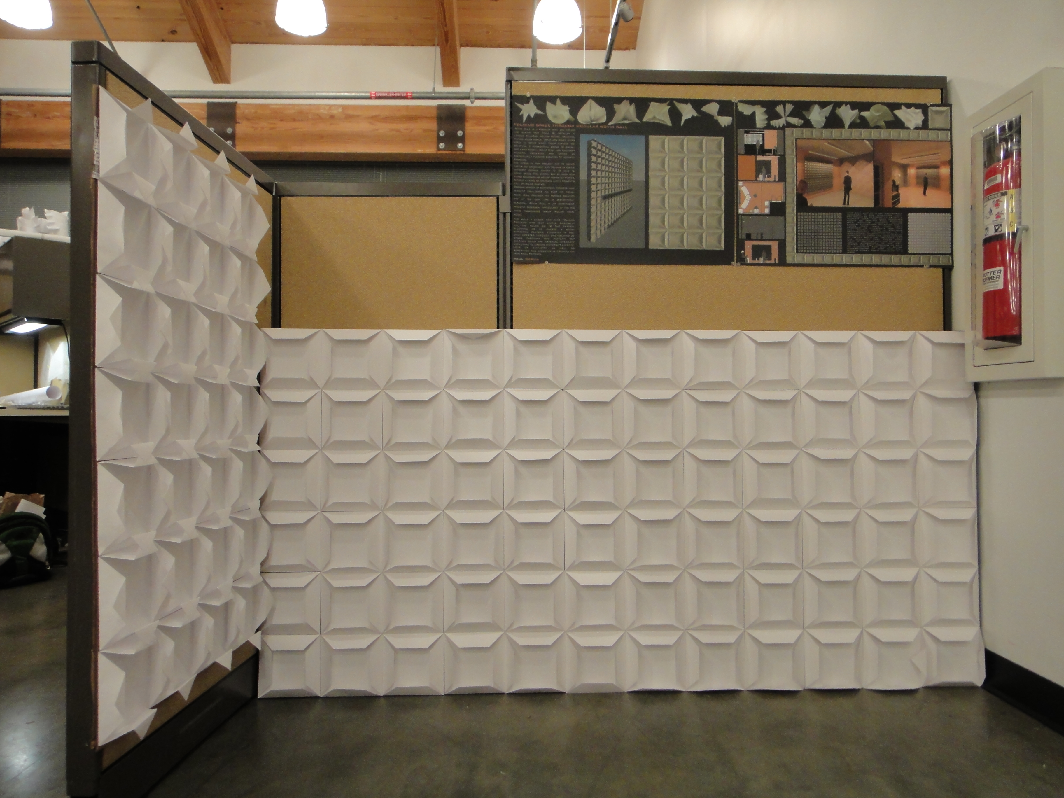
Folding Space Through Wovin Wall and Modular Acoustic Ceiling Panels

Wovin Wall is a modular system which can be extended in any direction to suit most spaces. For interiors which change frequently (such as exhibition and retail spaces), the modular nature of the Wovin Wall product is the perfect medium to reflect new color schemes, product launches or seasonal changes. Wovin Wall is available in a wide variety of standard finishes such as 3form C3 Color, wood veneer, polyresin, laminate and anodized aluminum. They can also be made from custom materials to suit the client’s project.
Design Process
The basic concept that opened my mind to explorations through folding was a project that I had done at my previous college. I started out with the idea that I wanted to build a floor tile, this idea was very interesting because when working with tiles the results are symmetry, repetition and balance. And that is exactly what I was looking for and willing to build out of the fold project. I started out by playing with different shapes, and looking for patters that would give me symmetrical objects. Up to that point I did not have a rule which gave me a more control of what I was experimenting. After a couple of models and explorations that I did, I came up with a rule that would orient me to a certain point.
The rule was very simple, all folds come to the center, and based on that rule, I began to explore more of it. I kept building more models to give me an idea of which of those I could use towards a final one. Then I decided that I wanted to begin hanging all my models that were meeting my rule. I hung 10 models that I thought would begin to give me a certain idea of repetition. Ideas kept going through my head and as I kept looking at those models, I started noticing a relationship of paper and lighting. Then I got the idea of building a modular suspended ceiling panel. Throughout my research I found out that ceiling panels play a major role with acoustics, absorbing the sound and defining space of a certain room. Modular ceiling panels are used in reception desk area, bars, meeting rooms, waiting rooms, and so forth.
After I decided which of my models I wanted to use for my full scale model, I began to research on diagramming. One of the sources that helped me a lot was “The Function of Form” , a book that has complete diagrams and structures that gave me inspiration. After I got a clear understanding of where my project was heading to, I began to think about scale, materials, human interaction, and components that are critical to acoustic ceilings as well as components that are integrated in modular ceiling panels such as lighting.
FINAL BOARD 1

FINAL BOARD 2

FINAL BOARDS AND MODEL DISPLAY


Friday, December 3, 2010

READING COMPREHENSION 7


Migrant Mother Nipomo, California [1936]


For many, this picture of Florence Owens Thompson at age 32 represents the Great Depression. She was the mother of 7 and she struggled to survive with her kids catching birds and picking fruits. She and her family had left Oklahoma in 1925, before the Depression. The 30s made their situation worse. She and the family were following the migrant trail moving from place to place as crops became ready for harvest. Dorothea Lange took the picture after Florence sold her tent to buy food for her children. She made the first page of major newspapers all over the country and changed people’s conception about migrants.
From looking at this black and white photo, the first thing I noticed is how different types of lines (soft, medium, heavy, extra heavy) are created all over the picture to define texture, material, emotion, balance of light and dark. Soft lines as well as medium and heavy lines are visible on the child's cloth located on left. Heavier lines are visible on the woman's clothing, this heavier lines create that emotional expression that is the central focal point on the photo.  
Contrast is very very strong in this image, specially because the original photo was taken in black and white, so the light and dark is very noticeable. The woman's face is what capture light the most, part of her arm captures light as well as the child's neck on the left. Black and white photos provide more contrast than colored photos and are easier when working with light and shadow. One of the ways I see balance on this image is that the shape created by the woman is much more larger than the shape created by the the two children. The woman is centrally centered on the image, therefor creating a much more larger shape than the child on the right being close to the edge of the image. Unity is seen by the the different textures on the image, clothing is much more lighter texture than the background which I'm not really sure what the material is. 


Analyzing the Study for the Heart of the Rose by Elihu Vedder [1923 - 1936] one gets a sensation of feminism. Women are naturally attracted and conquered by roses, and this image represents the appreciation of nature as it relates to the nudity of the natural body lines of the woman posing in the middle of the rose. 
In architecture and design this could be linked to  Massey's statement " From the 19th century the two areas had been distinctly separated, with the feminine sphere of the home regarded as a temple of comfort and moral respectability, a refuge from the workplace" (Massey pg. 197) Architecture sometimes could be seen feminine with different textures, materials, artifacts, etc. 
In the mean while, Le' Corbusier was starting to incorporate new techniques in modern buildings as the era of architecture and design were changing. "Fifth, the villa savoy was provided with a roof garden" (Roth pg. 532) These were the beginnings of sustainable design in the 1950's. Becoming green is a high priority for urban planners. The environmental and aesthetic benefits to cities is the prime motivation. It was calculated that the temperature in Tokyo could be lowered by 0.11–0.84 °C if 50% of all available rooftop space were planted with greenery. This would lead to a savings of approximately 100 million yens per day in the city's electricity bill. The importance of roof garden structures is not only to make the building look "attractable" but more like to make the structure environmentally designed. 
Joe's cafe in London and the Josephs Shops, incorporated industrial materials like aluminum and tension steel cables" (Massey pg. 201) This era of design was completely when a variety of materials were starting to be incorporated in interiors of structures. The steel cables are now used in stair rails to provide a sense of stability and innovation in design. These steel cables also provide a sense of tension which is what most engineers use  in bridge design.